Building a Real-Time Sports Analytics Pipeline with Kafka and Python
This is Part 2 of 3 in the Mountain Biking Efficiency Indicator series.
Previously: Quantifying the Unquantifiable: Designing the Mountain Bike Efficiency Matrix — Part 1: How we designed a mathematical framework to measure technical skill in cross-country mountain biking by mapping the relationship between power output and velocity.
Part 1 defined what “efficient” means on a mountain bike: a way to map power and velocity into quadrants a coach could read at a glance, and a statistical method — z-score normalization — to make that comparison fair across riders, sessions, and terrain.
That gave us a model, not a tool. Swiss Cycling didn’t need a formula on paper; they needed something a coach could pull up trackside, fed by sensors out on the course in close to real time. This post is about that translation: turning the mathematical definition of efficiency into a system that captures power and timing data in the field, streams it through Kafka, and renders it as the same quadrant chart we designed in Part 1 — updating live as a rider crosses each segment.
From Concept to Implementation
The thesis had two main components: understanding how Swiss Cycling actually works with performance data, and building a system that could integrate into their workflows.
Understanding the Context: Analytics Translation
I spent time observing Swiss Cycling’s analytics translation process: the organizational workflow for collecting, analyzing, and applying performance data. This included a field session in Sursee where we recorded athletes on a purpose-built test course.
The course was divided into predefined segments, each timed using Freelap timing gates. These gates are far more accurate than GPS in forested terrain where satellite reception is spotty. Power data came from bike-mounted power meters (SRM, Quarq, or similar) integrated through the Axiamo platform — a bespoke software solution — which Swiss Cycling uses for data collection and management.
Through detailed interviews with a sports scientist, I learned about the constraints of field-based data collection. Weather can force immediate session termination. Equipment must be reliable, coaches don’t have time to troubleshoot technical issues during limited training windows. Whatever tool we build cannot add complexity to an already demanding process.

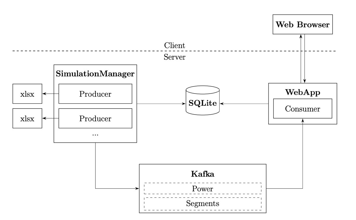
This context was crucial for architectural decisions. The system needed to integrate with existing tools, handle variable data quality, and provide value even when real-time infrastructure isn’t available. This last point led to a critical design choice: build the system around event streaming architecture, but include a simulation mode that replays historical data.
Technical Architecture: Streaming at the Core
The system architecture centers on Apache Kafka, a distributed event streaming platform. Kafka acts as the nervous system, handling continuous streams of power measurements and segment timing events.
Why Kafka? Three reasons. First, it decouples data collection from processing, the producer (whether live sensors or simulation) doesn’t need to know about consumers. Second, it provides reliability through persistence and replication. Third, it enables multiple consumers to process the same data stream differently — one for real-time visualization, another for archival storage, a third for analytics.
The visualization runs as a web application built with Flask (Python), Alpine.js (lightweight JavaScript framework), and Chart.js (visualization library). The key architectural choice was using Server-Sent Events (SSE) for real-time updates rather than WebSockets.
SSE provides unidirectional streaming from server to client — perfect for pushing performance updates without the overhead of WebSocket’s bidirectional communication. The client establishes a connection and receives updates as they arrive:
 1// Client-side event stream handling
 2const eventSource = new EventSource('/stream');
 3
 4eventSource.onmessage = function(event) {
 5    if (event.data === "heartbeat") return;
 6
 7    const segmentData = JSON.parse(event.data);
 8    updateEfficiencyMatrix(segmentData);
 9};
10
11eventSource.onerror = function(error) {
12    console.error("SSE connection lost:", error);
13    // Automatic reconnection handled by browser
14};
SSE has another advantage: automatic reconnection. If the connection drops (network hiccup, server restart), the browser automatically reconnects. For field-based coaching scenarios where network reliability might be uncertain, this resilience matters.
The Data Pipeline: From Sensor to Visualization
Let’s trace a single power measurement through the system.
Every second, the power meter broadcasts a message containing instantaneous power, cadence, torque, and timestamp. In simulation mode, this comes from replaying Excel exports; in production, it would come from live sensor feeds. The producer publishes this to Kafka’s power topic:
 1# Example power message structure
 2power_message = {
 3    "wallTime": 1234567890,       # Unix timestamp
 4    "instantPower": 285,          # Watts
 5    "cadence": 87,                # RPM
 6    "torque": 31.5,               # Nm
 7    "normalizedPower": 267,       # 30-second rolling average
 8    "simulation_id": "abc-123",   # Reference to this run
 9    "name": "Rider A"             # Athlete identifier
10}
These messages accumulate in a buffer. The consumer subscribes to both power and segments topics. Power messages flow continuously, but nothing happens until a segment-complete message arrives:
1segment_message = {
2    "simulation_id": "abc-123",
3    "number": "1.3",              # Lap 1, Segment 3
4    "duration": 127.5             # Seconds
5}
When the consumer receives a segment message, it triggers batch processing of all buffered power data for that segment:
 1def process_segment(simulation_name: str, segment_message):
 2    # Grab all buffered power messages for this segment
 3    with messages_lock:
 4        messages = stream_messages.pop(simulation_name, [])
 5
 6    # Extract power and cadence arrays
 7    power_instant = [x['instantPower'] for x in messages]
 8    cadence = [x['cadence'] for x in messages]
 9
10    # Compute basic averages
11    power_avg = sum(power_instant) / len(power_instant)
12    cadence_avg = sum(cadence) / len(cadence)
13
14    # Calculate advanced metrics
15    duration = segment_message['duration']
16    weight, ftp = get_rider_profile(segment_message['rider_name'])
17
18    np_score = calculate_normalized_power(power_instant)
19    if_score = calculate_intensity_factor(np_score, ftp)
20    tss_score = calculate_training_stress_score(
21        np_score, if_score, ftp, duration
22    )
23    watts_per_kg = power_avg / weight
24
25    # Store in database
26    segment = Segment(
27        simulation_id=segment_message['simulation_id'],
28        number=segment_message['number'],
29        power_avg=power_avg,
30        cadence_avg=cadence_avg,
31        duration=duration,
32        normalized_power=np_score,
33        intensity_factor=if_score,
34        tss=tss_score,
35        watts_per_kg=watts_per_kg
36    )
37
38    segment_repository.add(segment)
This happens in milliseconds. The segment data immediately becomes available to the web application, which broadcasts an update via SSE to all connected clients. The chart updates in real-time.
Computing Normalized Power: Accounting for Variability
One of the key metrics is Normalized Power (NP), a power output metric that better represents the physiological cost of variable efforts. Average power doesn’t tell the whole story because physiological stress doesn’t scale linearly with power output.
Consider two efforts, both averaging 200 watts:
- Effort A: Steady 200 watts for 5 minutes
- Effort B: Alternating 100 watts and 300 watts every 30 seconds
Average power is identical, but Effort B is much harder physiologically. The repeated surges to 300 watts create greater metabolic stress than steady-state riding.
Normalized Power accounts for this through a clever algorithm:
 1def calculate_normalized_power(power_data: list[float]) -> float:
 2    """
 3    Calculate Normalized Power using 30-second rolling average method.
 4
 5    NP better represents the physiological "cost" of variable efforts
 6    by applying a 4th power transformation that weights surges heavily.
 7    """
 8    power_data = np.array(power_data)
 9    window_size = 30  # 30-second rolling window
10
11    if len(power_data) < window_size:
12        # Not enough data for rolling average
13        moving_avg = np.mean(power_data)
14    else:
15        # Compute 30-second rolling average
16        weights = np.ones(window_size) / window_size
17        moving_avg = np.convolve(power_data, weights, mode='valid')
18
19    # Apply 4th power transformation (weights surges)
20    moving_avg_4th_power = moving_avg ** 4
21
22    # Average and take 4th root
23    avg_4th_power = np.mean(moving_avg_4th_power)
24    normalized_power = avg_4th_power ** 0.25
25
26    return normalized_power
The 4th power transformation is the key. By raising values to the 4th power before averaging, high-power efforts are weighted much more heavily than low-power efforts. A surge to 400 watts contributes vastly more to the average than cruising at 100 watts, even if the durations are equal. This reflects physiological reality: brief hard efforts are disproportionately costly.
From Normalized Power, we can compute two additional metrics:
Intensity Factor (IF): The ratio of NP to FTP (Functional Threshold Power). IF tells you how hard an effort was relative to what the rider can sustain for an hour. IF of 0.9 is a hard workout; IF of 1.2 is unsustainable.
1def calculate_intensity_factor(normalized_power: float, ftp: float) -> float:
2    return normalized_power / ftp
Training Stress Score (TSS): A measure of the training load from a ride, accounting for both intensity and duration.
1def calculate_training_stress_score(
2    normalized_power: float,
3    intensity_factor: float,
4    ftp: float,
5    duration_in_seconds: float
6) -> float:
7    TSS = (duration_in_seconds * normalized_power * intensity_factor) / (ftp * 3600) * 100
8    return TSS
These metrics, combined with segment duration, form the raw data that feeds into the efficiency matrix visualization after z-score normalization.
Configuration Over Code: Flexibility for Coaches
One of the best architectural decisions was making the system configuration-driven. Instead of hard-coding visualization parameters, everything lives in a YAML config file:
 1chart:
 2  views:
 3    - name: "Power vs. Time (Z-Score)"
 4      xData: "time_zscore"
 5      yData: "power_zscore"
 6      xLabel: "Time (Z-Score)"
 7      yLabel: "Power (Z-Score)"
 8      xScale:
 9        min: -3.0
10        max: 3.0
11      yScale:
12        min: -3.0
13        max: 3.0
14
15    - name: "Power vs. Time (Modified Z-Score)"
16      xData: "time_modified_zscore"
17      yData: "power_modified_zscore"
18      xLabel: "Time (Modified Z-Score)"
19      yLabel: "Power (Modified Z-Score)"
20      xScale:
21        min: -3.0
22        max: 3.0
23      yScale:
24        min: -3.0
25        max: 3.0
26
27    - name: "Watts per Kilo vs. Absolute Time"
28      xData: "time_absolute"
29      yData: "watts_per_kilo"
30      xLabel: "Time (s)"
31      yLabel: "Watts per Kilo"
32      xScale:
33        min: null  # Auto-scale
34        max: null
35      yScale:
36        min: null
37        max: null
This means coaches can experiment with different views — z-score normalized, modified z-score, absolute values, watts per kilo — without touching code. They can adjust axis ranges, add new metrics, or change visualization styles by editing a text file.
The same flexibility benefits administrators: rather than every coach needing to understand YAML, an admin can curate a focused set of views per coach or squad ahead of time, so each coach opens the dashboard to exactly the views relevant to their athletes.

The config file also defines application behavior: Kafka connection details, database paths, simulation speed factors, making the system adaptable to different deployment environments. For development, I used a local Kafka instance and SQLite database. For production, Swiss Cycling could deploy with a proper Kafka cluster and PostgreSQL without changing application code.
The Simulation Component: Building Without Real-Time Infrastructure
Here’s a practical problem: Swiss Cycling doesn’t yet have real-time data streaming infrastructure on their training courses. Installing network connectivity, setting up Kafka brokers, and integrating with live sensors is a significant investment. How do you validate the system without that infrastructure?
The answer was building a simulation component that replays historical data through the same pipeline as live data would flow. The simulator reads exported Axiamo data (Excel format) and publishes it to Kafka topics at appropriate intervals:
 1class PerformanceData:
 2    def __init__(self, file_name: str):
 3        self.file_name = file_name
 4        self.data_dict = self.load_file()
 5        self.current_frame = self.get_start_frame()
 6
 7    def load_file(self):
 8        """Load and structure data from Excel export."""
 9        df = pd.read_excel(self.file_name, sheet_name=None)
10
11        # Parse segment definitions
12        df_segments = df['Segments']
13        segments = deque()
14        for _, row in df_segments.iterrows():
15            wall_time = round(row['StartTime'] + row['Duration'])
16            segments.append({
17                'wallTime': wall_time,
18                'number': row['Number'],
19                'duration': row['Duration'],
20                'startTime': row['StartTime'],
21                # ... additional segment metadata
22            })
23
24        # Parse power data and associate with segments
25        data_dict = {}
26        df_power = df['PowerData']
27        for index, row in df_power.iterrows():
28            frame = row['Unnamed: 0']
29            data_dict[frame] = {
30                'power': {
31                    'wallTime': row['WallTime'],
32                    'instantPower': row['InstantPower'],
33                    'cadence': row['Cadence'],
34                    # ... additional power metrics
35                },
36                'segment': None
37            }
38
39            # Attach segment marker if we've reached segment boundary
40            if segments and segments[0]['wallTime'] < next_wall_time:
41                data_dict[frame]['segment'] = segments.popleft()
42
43        return data_dict
44
45    def get_current_frame(self):
46        """Retrieve next frame of data, advancing the cursor."""
47        if self.current_frame < self.get_start_frame() + self.get_num_frames():
48            frame = self.data_dict[self.current_frame]
49            self.current_frame += 1
50            return frame['power'], frame['segment']
51        return None, None
The simulation manager then publishes this data to Kafka at intervals controlled by a simulationFactor in the config:
1# With simulationFactor = 0.5, data streams twice as fast as real-time
2# This lets coaches review sessions quickly during debriefs
3simulationFactor: 0.2
This “replay” capability turned out to be more valuable than just a development tool. It became a training aid. Coaches can review past sessions, explore “what if” scenarios, and have structured conversations with athletes about strategy and technique. The efficiency matrix makes these conversations more concrete: “Look at lap 2, segment 4, you shifted from green to yellow. What changed?”

Next Up: The Human Element
The engine is built, the data is flowing through Kafka, and the UI is updating in real-time. But a sophisticated dashboard is useless if it doesn’t solve the user’s problem. What happens when you put this tool in the hands of Olympic-level coaches?
In Part 3: What Real-Time Analytics Reveals About Mountain Biking, we’ll explore the actual insights generated by the system. From tracking fatigue degradation to making data-backed decisions on bike equipment.